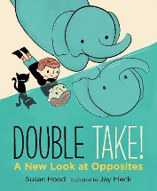
Double take! a new look at opposites by Susan Hood

Ill. by Jay Fleck. Walker Studio, 2015. ISBN 9781406377293
(Age: 4+) Highly recommended. Opposites. Perspective. Points of
view. More than a look at opposites, this interesting picture book
is also a challenge for the reader to ponder and delve into what an
opposite really means and to think about different points of view.
Hood has written an engaging, thought provoking text in rhyme,
looking not just at what a simple opposite can mean but how it
relates to who wants to know and the perspective of the person
asking:
Who knows what's BIG
unless there's SMALL?
Does SHORT mean a thing
except next to TALL?
The illustrations done in a retro style by Jay Fleck are evocative
and add much to the text. The one on the back of the book with the
blurb was particularly engaging showing a tall flower in a small pot
with a bird looking at it and a short flower in a big pot with a
mouse looking at it. Another that caught my eye was the elephant
lifting a large weight that contrasted with the boy trying to lift a
small one:
Who's STRONG
and who's WEAK
is hardly perplexing
Then the reader turns the page to see a double page spread with a
giant whale and the text:
But STRONG can look WEAK
when a new champ is flexing.
The use of different styles of print to highlight the point being
made also adds to the fun of the book and would lead to easy
emphasis when reading aloud.
This would be a very useful book to have in the classroom, and its
easy rhythm and fun illustrations will engage both readers and
listeners.
Pat Pledger